Articles ·
$1.5M for a Logo? If It's Paula Scher's, Yes.
Most people hear “$1.5 million for a logo” and immediately scoff. A sketch on a napkin? Done in seconds? Must be a scam, right?
That napkin doodle was done by Paula Scher.
And it might just be one of the most iconic, strategic, and cost-effective investments a global brand has ever made.
The $1.5 Million Napkin Sketch
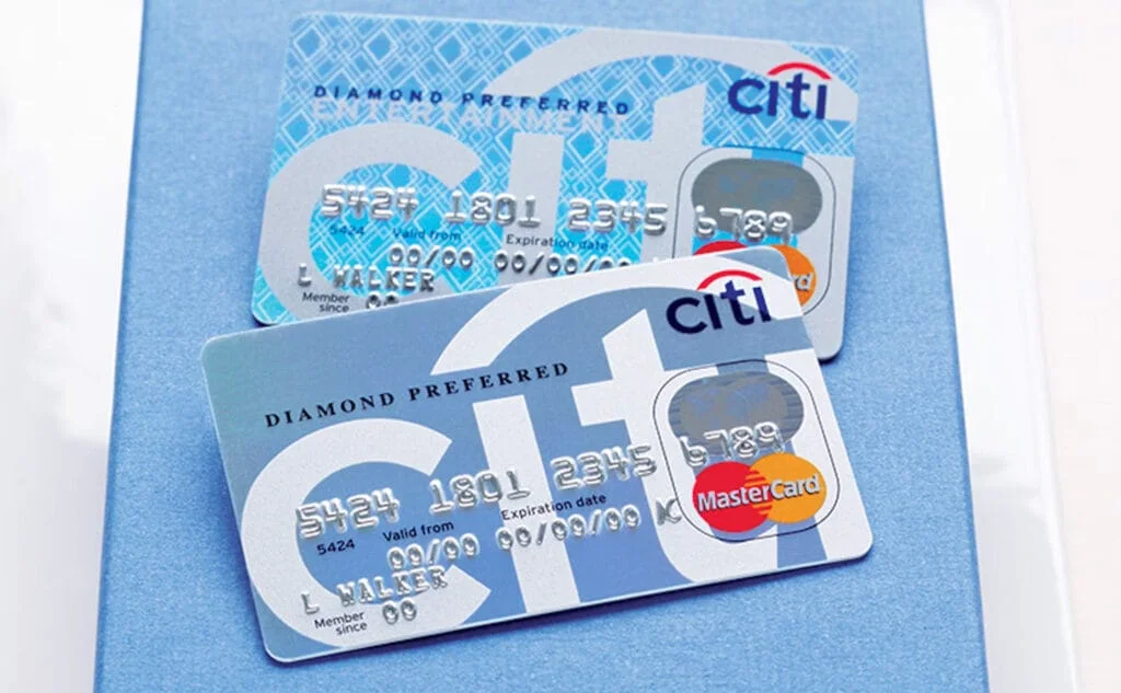
In 1998, two financial giants, Citicorp and Travelers Group, merged to form what would become Citigroup. With a valuation of $140 billion and assets under management totaling $700 billion, they needed more than just a logo. They needed a unifying identity.
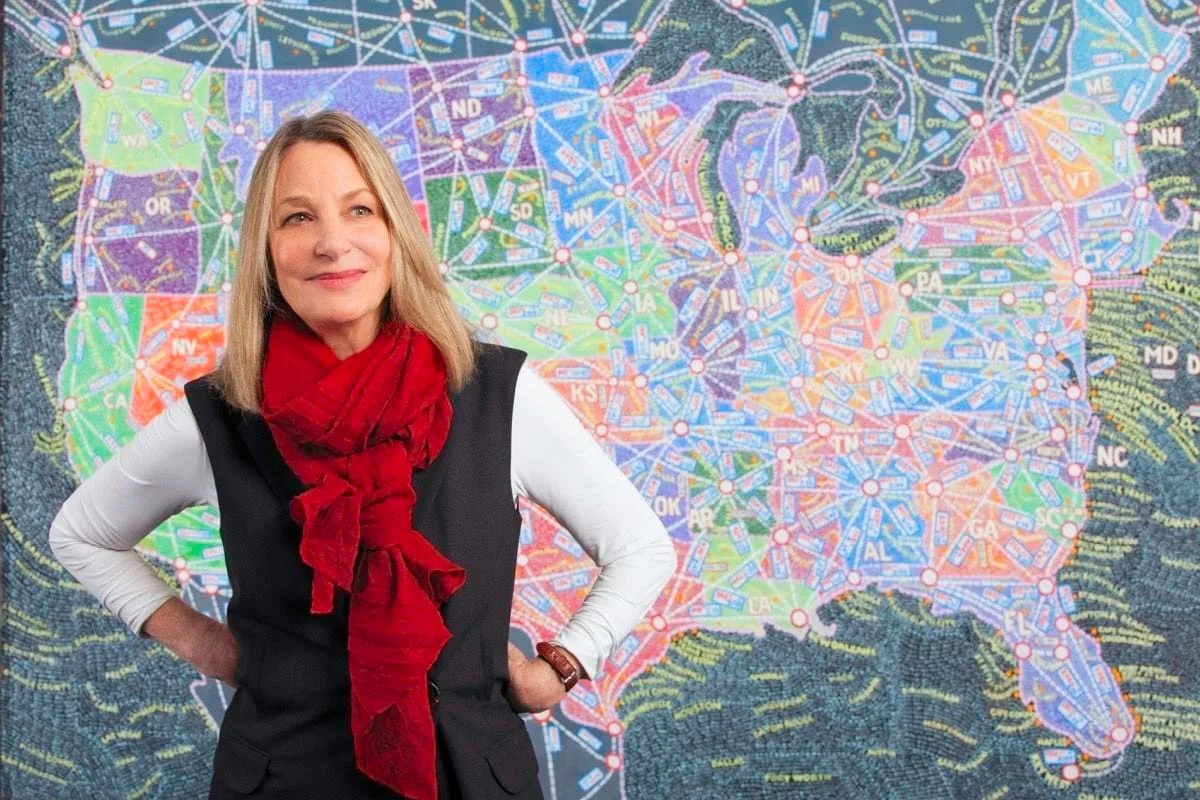
Enter Paula Scher, a partner at Pentagram, one of the most respected design firms on the planet. Pentagram isn’t just a logo factory. It’s a multidisciplinary design agency that tackles complex business challenges with strategic creativity. And Paula? She’s a design legend, someone who’s been shaping visual culture for decades.
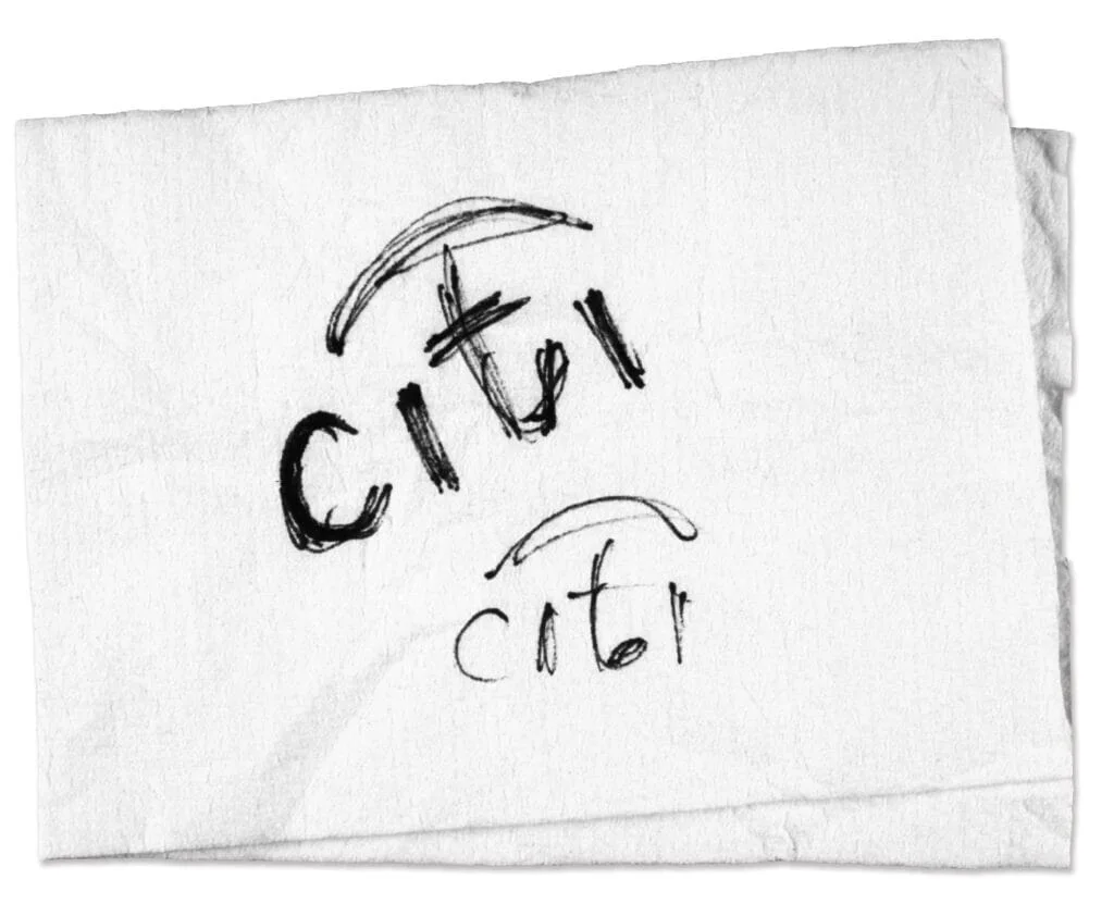
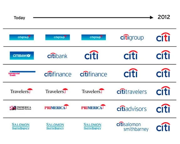
When Scher met with Citibank leadership to understand their needs, she listened carefully. As they talked, she casually sketched an idea on a napkin: the word “Citi” topped with a red arc. It looked almost too simple. But that red arc? It subtly referenced the Travelers Group’s red umbrella, symbolizing protection and continuity.
That ten-second sketch? It stuck.
But That Was Just the Beginning
OK, full confession: this is the part non-designers always miss. The napkin moment was just the spark. What followed were months of deep work:
- Dozens of iterations
- Alignment with marketing, legal, and executive stakeholders
- Guidelines for every possible application: print, digital, signage, uniforms, ATMs
- System updates for global consistency across hundreds of touchpoints
It was like redesigning your entire wardrobe, furniture, haircut, body shape, and even posture, just to walk into the world as the evolved version of yourself. A full identity transformation. You’re not just changing outfits; you’re changing how you move through the world.
The logo was just the tip of the brand iceberg. The full rebrand budget? $10 million. That covered everything from strategy to rollout. So yes, $1.5 million for the logo, but also for decades of recognition, trust, and consistency.

Why The Logo Works So Damn Well
Let’s break it down:
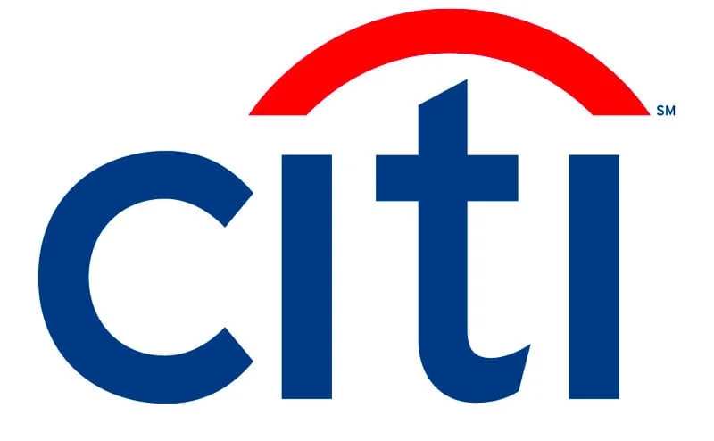
Typography: The logo uses Interstate, a clean sans serif typeface based on highway signage, designed to be legible, clear, and friendly. The letterforms were subtly tweaked: the “t” was customized to align visually with the red arc (looking a bit like an umbrella handle), the “c” more circular and open. These aren’t just design flourishes; they’re brand decisions.
Color: Red and blue over white. Blue for trust, professionalism, and financial conservatism. Red for energy, innovation, and a nod to the Travelers legacy. Oh, and they’re also America’s colors, reinforcing Citibank’s roots.
Symbolism: The red arc does a lot of heavy lifting. It recalls the old umbrella logo from Travelers while also suggesting unity, protection, and forward motion. It’s a gesture of continuity without clinging to the past.
All lowercase: “citi” in lowercase softens the tone. It feels accessible, customer-friendly, modern: something a corporate monolith desperately needs when talking to individual people.
The Real Value of Branding
Here’s the thing: logos are easy to look at. Which makes them easy to judge. But branding isn’t about the drawing; it’s about the thinking behind it.
Branding is what separates a respected financial institution from a no-name fintech startup. It’s what creates trust when you see a sign on a building or a screen on your phone. And more than that, branding is alignment. It’s strategy. It’s tone, personality, positioning, storytelling.
Think of it like this:
A logo isn’t your brand. It’s the tip of the spear. The handshake. The first impression. But behind it is the voice, values, and experience people have when they interact with your company.
That’s what Scher and Pentagram brought to the table. Not a napkin doodle. A full transformation.
Design Is an Investment, Not an Expense
It’s tempting to see design as decoration. But good design is function, meaning, and value creation. And great design? Great design is business strategy in visual form.
- Design saves money (by avoiding miscommunication and inconsistency)
- Design builds trust (instantly, viscerally)
- Design creates emotional connection (which drives loyalty)
Technical difficulty doesn’t equal a good result; in logo design, it’s often the opposite. The simpler it is, the harder it was to get right. Because making something look easy is incredibly hard.
Design and branding aren’t commodities.
Design and branding aren’t commodities. They’re not expenses to minimize; they’re critical investments. Your brand is your company’s identity, culture, and reputation all rolled into one. It’s how customers perceive you. How they feel about you. And how they decide if they’ll trust you with their time, money, or loyalty.
So was $1.5M for the Citibank logo expensive? Was $10M for the full rebrand too much? Not even close. For a company with global reach and billions in assets, it’s a no-brainer.
A strong visual identity adds exponential value at scale. And as the saying goes: if you think good design is expensive, you should see the cost of bad design.
If you think good design is expensive, you should see the cost of bad design.
That cost? It’s measured in millions, or billions, of lost revenue, fractured trust, and missed opportunities.
Citibank’s $1.5M logo is still in use over 25 years later. Across thousands of branches, cards, websites, apps. That’s not expensive. That’s efficient. That’s ROI.
The Designer’s Paradox
Designers often get punished for doing their job well. Because when we make things look simple, people assume it was simple. But that’s the magic of expertise:
It took Paula Scher 30 years to learn how to draw that logo in 10 seconds.
And no one else in the room could’ve done it.
Simplification is complex. The work is choosing from an endless space of possibilities and distilling them into one powerful answer. That’s the real job. That’s the hard part.
When we know the solution, anyone can say it’s obvious. But that’s cheating.
As creatives, we’re constantly navigating approvals, translating between stakeholders, and guiding non-designers down the right path. We make the complex feel effortless, and that effortlessness? It’s hard-earned.
Our work is visual, so it’s easy to see, and just as easy to criticize. Especially when those criticizing don’t have the language or framework to understand what they’re looking at.
What You Should Take From This
If you’re building a business or scaling a brand:
- Don’t treat your logo like clip art.
- Don’t rush through branding like it’s just aesthetics.
- Hire experts. Trust the process.
And if you’re a designer:
- Own your value. Educate your clients.
- Make the complex look easy, but never be easy.
- Be like Paula: listen hard, think deeper, sketch smarter.
Final Thought
Designers don’t just make things look good; we make them make sense.
A logo isn’t about what it looks like. It’s about what it means. And the best ones don’t just say who you are; they show who you’ve become.
Because at the end of the day, design isn’t just about how something looks; it’s about what it does.
Thanks for reading. Share this with someone who still thinks design is just “making things pretty.”